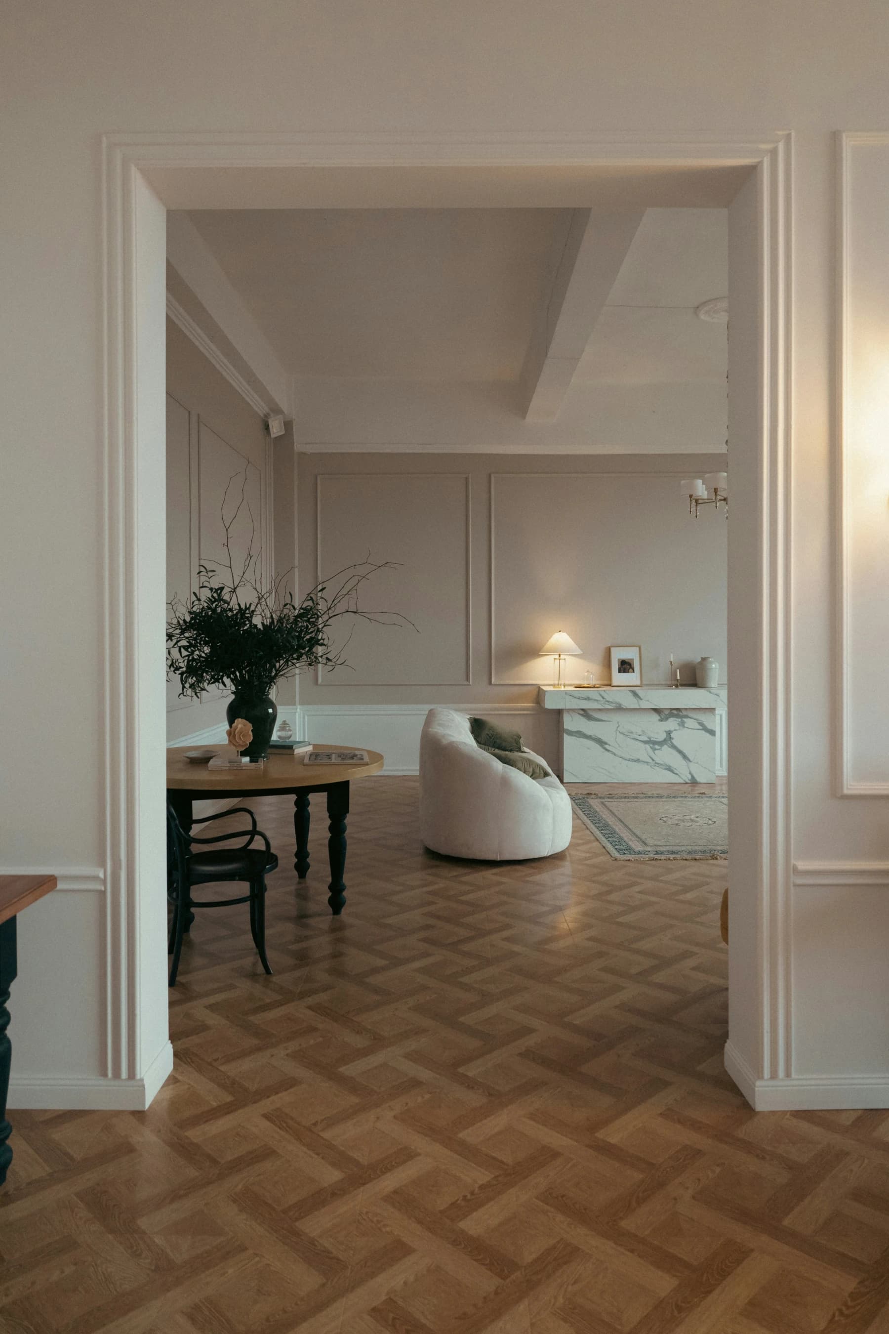
Colors for a Dark Home: Brightening Low-Light Rooms

Paola Colonna
Interior Designer
May 17, 2026 · 7 min read
A dark home is not a hopeless home. It is a home that calls for different solutions than a sun-drenched apartment — and one that, with the right choices, can achieve a warmth that brighter, more anonymous spaces rarely match.
The first shift to make when thinking about color in a low-light room is to stop chasing maximum brightness and start pursuing warmth instead. These are not the same thing. A room can be technically pale and feel cold and flat; it can also carry slightly deeper tones and feel alive and inviting. The difference almost always comes down to undertone.
In my projects, I encounter this challenge constantly: ground-floor apartments in Italian city centers, rooms opening onto enclosed courtyards, north-facing flats in old stone buildings. These are among the most common situations for anyone buying or renovating in Italy, and they are entirely workable. Here is how I think through them.
Read Your Light
Before choosing any color, spend time observing the room's natural light through the day.
North-facing rooms receive constant but cool, indirect light — no direct sun at any hour. Colors tend to appear more desaturated and blue-shifted. You need tones with warm undertones (yellow, orange, rose) to compensate.
Internal rooms or courtyard-facing rooms receive reflected light — often bouncing off the gray or white plaster of the opposite building. If those walls are cool-toned, the reflected light is even flatter. If you have any control over the courtyard walls, painting them a warm cream or ochre can meaningfully improve the light that enters your windows.
High ceilings with small windows — typical of historic Italian palazzi — bring light in from above but leave the lateral walls in shadow. Reflective finishes and satin paint help distribute whatever light is present.
In all cases: observe the room in the morning, the afternoon, and in the evening under artificial light. The color that reads beautifully at ten in the morning may look flat at six in the evening — and the reverse is equally possible.
Warm Whites, Not Cool Ones
White seems like the obvious choice for a dark room. But the wrong white makes things worse: a cool white (with gray or blue undertones) absorbs whatever limited light exists and returns a flat, clinical tone.
The whites that work in low-light rooms are warm whites: those with yellow-ivory, sand, or rosy undertones. In practice: warm white, ivory, cream, butter white. These tones reflect available light while adding warmth rather than draining it.
A quick field test: buy two white paint samples — one "pure" or cool white (optical white, stark white) and one warm white (ivory, linen white). Apply both to the dark room's wall and look at them at 5 pm. The result is almost always immediately clear: the cool white goes gray; the warm white stays alive.
Colors That Warm
Beyond warm whites, several colors work specifically well in low-light conditions.
Butter Yellow and Pale Ochre
Yellow is the color closest to sunlight — and it works in dark rooms precisely for that reason. Not saturated, intense yellow, but very pale versions: butter yellow, straw, cream-ochre. Applied across all walls, these tones make a room feel bathed in light even on overcast days. They work particularly well in windowless entry halls and interior kitchens, where any other pale color would feel cold.
Pale Cipria and Nude
Cipria — a very desaturated pink, almost a warm neutral — is one of the most versatile colors for difficult rooms. It does not add warmth in the yellow sense, but it removes coldness: the room stops reading as gray without becoming colorful. It is discreet enough to work in any context and broadly appealing for resale.
Sage and Soft Green
Pale sage — in light tones with a yellow undertone — works well in north-facing and courtyard rooms because its earthy base counteracts the blue cast of cool indirect light without weighing down the space. It is a less obvious choice than yellow but often more refined, and pairs naturally with materials like wood, linen, and stone.
Terracotta as an Accent
Terracotta and brick tones are not well-suited as primary colors in a dark room — they risk absorbing what little light there is. Where they work beautifully is as accent: a cushion, a ceramic vase, a throw, a single far wall. A few terracotta presences are enough to warm the overall palette without sacrificing perceived brightness.
Finishes and Reflectance
Color is not the only variable: the finish you use changes how much light bounces off the surface.
- Matte/flat finish: absorbs light and softens wall imperfections, but reduces perceived brightness. Best avoided in dark rooms.
- Satin or eggshell finish: reflects a portion of available light without the full mirror effect of gloss. This is the finish I recommend for walls in low-light rooms.
- Gloss: high reflectance but shows every wall imperfection. Reserve it for doors, trim, or purpose-built surfaces in good condition.
Beyond wall finish, consider:
Light floors. A dark floor in a dark room creates a tunnel effect. If you cannot change the floor, a large pale rug covering most of the surface helps bounce light upward.
Mirrors and soft gold metallics. A large mirror positioned facing the window — or the main artificial light source — multiplies available light. Soft gold metals — brass, matte gold — reflect warm light without the coldness of steel or chrome. In Italian historic apartments, these materials are also architecturally appropriate.
Test Before You Commit: The Step Most People Skip
You buy the swatch, it looks beautiful in the shop, you order twenty liters. Then the finished room looks nothing like what you imagined.
The reason is almost always the same: the swatch was small, seen under the shop's fluorescent lighting, and never observed in the actual light of your room.
How to test a color properly:
- Buy a sample of at least 300 ml — most paint brands now offer small test pots for this.
- Paint two adjacent walls — not a single rectangle — roughly 20×20 inches each, meeting at the corner. This lets you see the color in both direct light and shadow at the same time.
- Observe it at three moments: morning, afternoon, and evening with artificial lights on.
- Look at it from the adjacent room as well as from close up — the color seen from a distance through a doorway is the one you will live with most.
Pair Color with Artificial Light
The most carefully chosen wall color cannot compensate for wrong artificial light. In rooms with limited natural light, artificial light is the primary light source for much of the day — and the choice matters more, not less.
The fundamental rule: use light sources at 2700–3000 K (warm light) throughout. Cool light (4000 K and above) amplifies the feeling of darkness and gloom in an already low-light room. Two new bulbs at the correct temperature can do more for the room than a coat of paint.
For a complete lighting plan that works in sync with your color choices, read our lighting guide. And if the room is both dark and small — a very common combination in Italian apartments — colors for a small home covers the two constraints together.
Five colors for a dark room — the quick list:
- Warm white / ivory — the safest starting point
- Butter yellow / cream-ochre — the closest thing to bottled sunlight
- Pale cipria — a warm neutral that removes coldness without adding color
- Soft sage — earthy, elegant, counteracts north-light blue shift
- Warm greige — gray with a beige-rose undertone; modern and welcoming
If you are navigating a ground-floor apartment in Rome or Milan, a deep room in an old stone building, or a property with north-facing or courtyard-facing windows, these choices come down to specific details that a tailored color consultation can resolve far faster than trial and error. We work on exactly these kinds of spaces.
Let's talk about your project — the first consultation is free.
Request a free consultationAbout the author

Paola Colonna
Interior Designer
Paola founded ATRIA from a passion for harmonious spaces. She leads interior design with a careful, personalized approach to materials, fabrics, and Italian craftsmanship.
Related articles
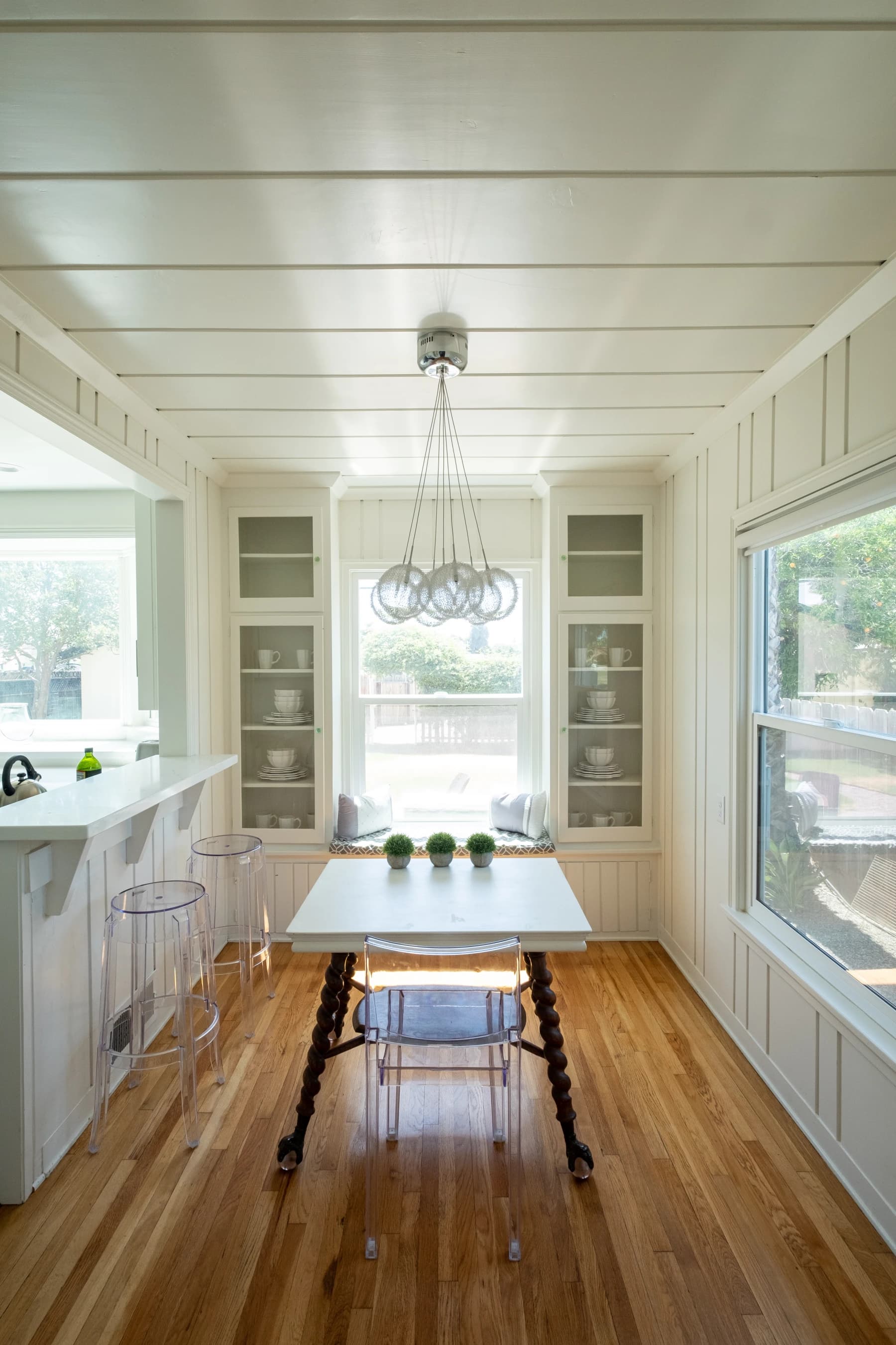
Colors for a Small Home: How to Make Rooms Feel Bigger
Light tones, measured accents, and designer tricks to make a small home feel larger and brighter.
May 10, 2026 · 7 min read
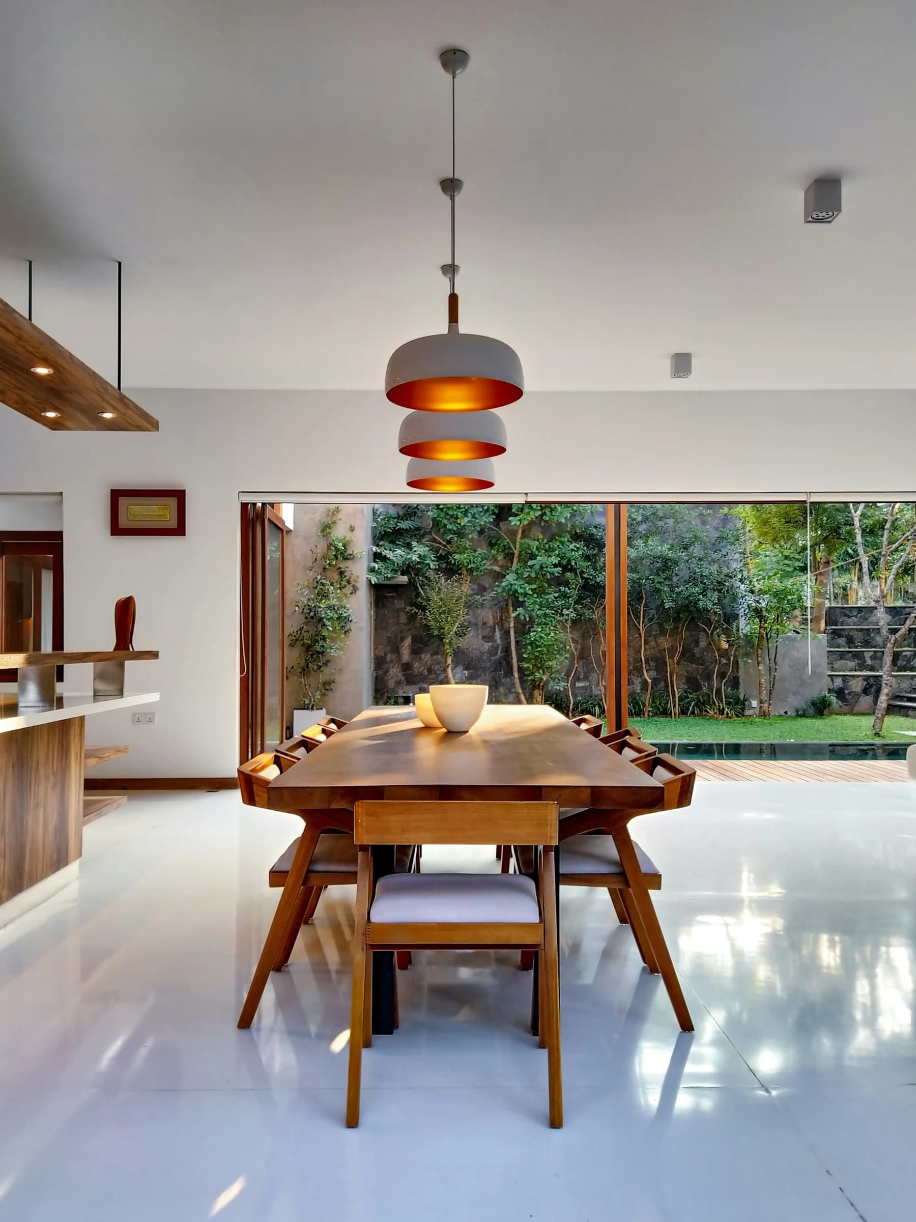
From Dream Home to Ideal Home
The dream home is an image; the ideal home is an answer. How to move from one to the other without losing beauty along the way.
June 30, 2026 · 13 min read
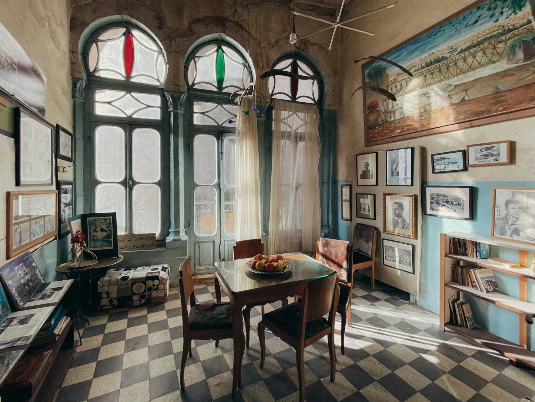
Five Italian Design Styles and How to Bring Them Home
From Roman classicism to Sicilian baroque — five distinct Italian aesthetics and the palettes that define them.
June 15, 2026 · 2 min read
Ready to start your Italian project?
Whether you are buying, renovating, or furnishing, ATRIA guides you every step with a bilingual team on the ground.
Request a consultation