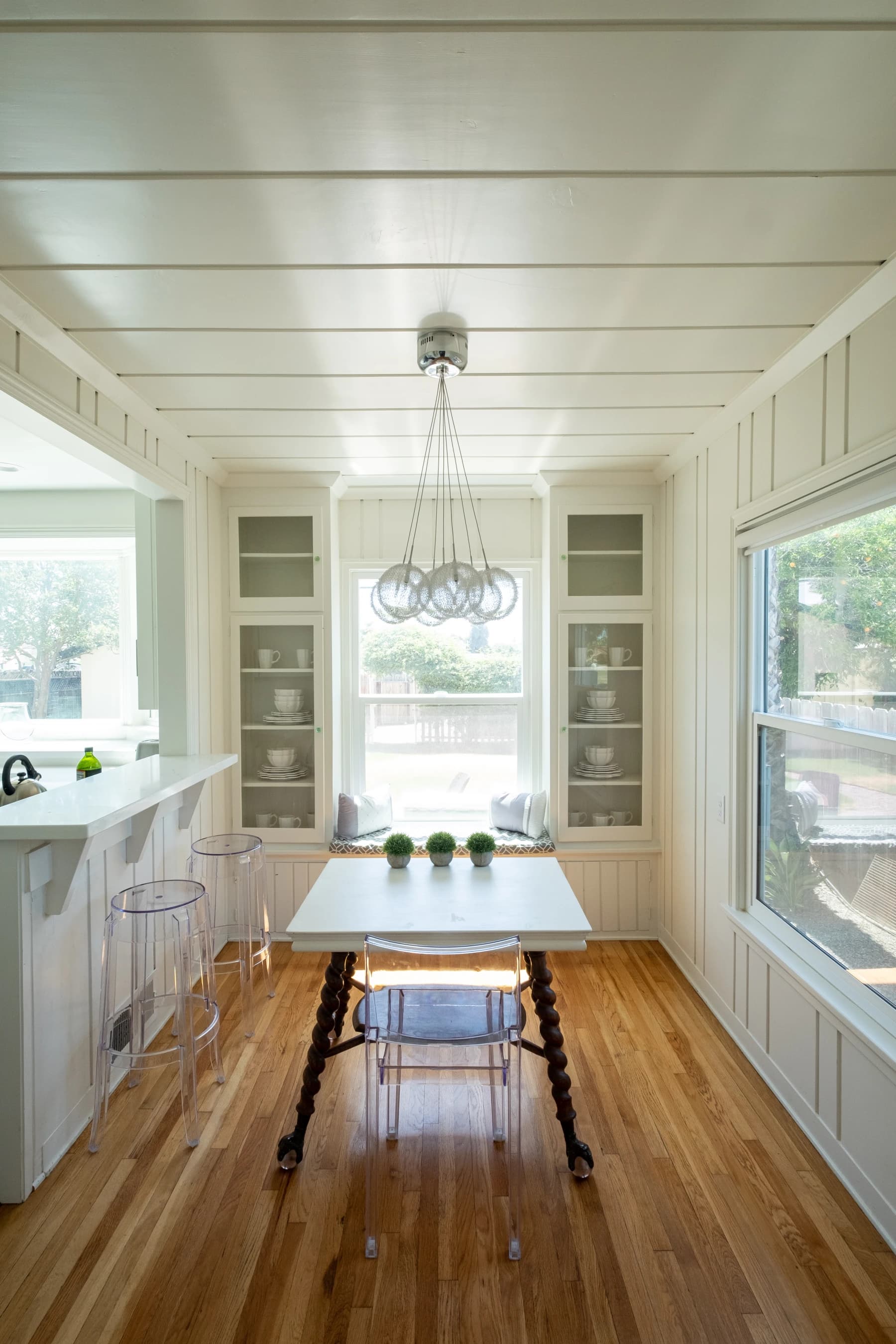
Colors for a Small Home: How to Make Rooms Feel Bigger

Paola Colonna
Interior Designer
May 10, 2026 · 7 min read
When a client tells me their home is small and asks what they can do about it, my answer almost always begins with color. Not because color works miracles — the walls stay where they are — but because the perception of space is largely optical, and color is the least expensive, most reversible tool you have to shift it.
The old advice to "just paint everything white" is both dated and, in many cases, counterproductive. Pure white can read as cold and clinical, and in a room with little natural light it tends to emphasize shadows rather than eliminate them. The approach I use in my projects is more nuanced: warm neutral tones, applied continuously, with measured accents — coherent throughout the whole home.
The Continuity Rule
The most underused trick for making a small space feel larger is not the specific tone but the continuity of that tone. When walls, trim, doors, and ceiling are all the same pale color — or very close to it — the eye finds no sharp edges to track, and stops measuring. The room reads as larger simply because it is harder to define where it ends.
In many Italian apartments, the standard combination is colored walls, white trim, and white ceiling: three distinct brightness values that cut the room into segments. Bringing the trim, baseboards, and ceiling to the same light tone as the walls — or close — is one of the highest-impact changes you can make without touching the structure.
Tones That Expand
Not all light colors work the same way. Cool whites — those with a blue or gray undertone — can look crisp by day but shift toward icy under evening artificial light. The tones that genuinely expand and warm a small space are warm neutrals: warm white, pale sand, blush-beige, greige, soft sage.
In our project palette, the tones I reach for most often in small homes sit in the travertine range — a warm white with sandy undertones — and pale cipria, a rosy neutral that reflects light without adding weight.
Why do warm neutrals outperform pure white? Because they reflect light without the harshness of a bright white. Surfaces appear lit even in the absence of direct sunlight — and in small Italian apartments, often with narrow windows and high surrounding buildings, that distinction is real and daily.
Ceilings, Trim, and Floors
The Ceiling
A light ceiling reads as higher. But "light" does not mean necessarily white: matching the ceiling to the wall tone (or slightly lighter) eliminates the hard line between wall and ceiling, which is what actually creates the sense of height. Standard white ceilings over colored walls emphasize the boundary instead.
If the ceiling is low — under about 8.5 feet — avoid dark ceilings entirely. If you have good height (9 feet or more), a slightly deeper ceiling can create a pleasing sense of enclosure, but in genuinely small homes this is a calculation to make carefully.
Doors and Trim
In Italy it is common to find dark-stained wood doors or rich walnut trim. In a small home, painting interior doors the same tone as the walls — or a warm white — removes a visual obstacle the eye crosses every time it sweeps the room. It is an inexpensive intervention with a surprisingly large effect.
Floor-to-Wall Transition
If the floor is light — travertine, natural-finish parquet, pale cotto — the transition from wall to floor will be nearly imperceptible, which reads as spacious. If the floor is dark, the contrast defines and emphasizes the room's perimeter. You cannot always change the floor, but you can choose wall tones that soften the contrast rather than amplify it.
Where to Use an Accent Color
A small home does not need to be a monochromatic box. An accent — a more saturated or deeper tone — can exist, but it should be concentrated and measured. The rule I find myself returning to is 60/30/10: 60% of the visual field in the primary neutral tone, 30% in a secondary tone (slightly warmer or cooler), 10% in an accent.
In a small home, that 10% is most effective in textiles and objects rather than on walls. A sage cushion, an ochre wool throw, a ceramic vase in a warm terracotta — these carry personality without shrinking the perceived space.
If you want to commit to an accent wall, choose the far wall — the one you see as you enter the room — and use a tone no more than three or four shades deeper than the neutral on the flanking walls. The effect reads as the wall being pushed further away, not brought closer.
Room by Room
Entry Hall
The entry is often the toughest case: narrow, poorly lit, with a door and trim that break the space into pieces. Use the lightest tone in your palette on all vertical surfaces, including the interior side of the front door if possible. A mirror on the wall opposite the entrance multiplies light and expands the perception of depth immediately — one of the simplest upgrades with the highest return.
Living Room
In a small living room, keep walls and ceiling in the same light tone. If you have a dark sofa or a statement rug, those will carry the color — the walls do not need to compete. A common mistake is adding a dark accent wall to a small, already-furnished living room: the result is almost always heavier, not more characterful.
Kitchen
In a small kitchen, the wall tone has to coexist with the cabinetry and countertops. If the upper cabinets are light, the walls can go slightly deeper for visual depth; if the cabinets are dark, a very pale wall lightens the whole space. Avoid high-contrast backsplash tiles in a small kitchen: choose tile tones close to the wall color — including the traditional Italian maioliche in muted palettes — rather than sharp contrasting patterns.
Bedroom
The bedroom benefits from tones that create warmth rather than maximum brightness. A pale cipria or a rosy greige are classic choices because they make the room feel gathered and restful. If the bedroom is genuinely small, paint the headboard wall the same tone as the rest of the room — a dark wood headboard in a small space visually isolates the bed from the walls and makes everything tighter.
Bathroom
A small bathroom tiled in a continuous light tone — same color on walls and floor — reads significantly larger than one with strong contrast between surfaces. If the bathroom has no window, favor tiles with a glossy or satin finish rather than matte: they multiply the artificial light rather than absorbing it.
Mistakes to Avoid
Too many colors. Three or more distinct colors in a small home fragments it into even smaller-feeling zones. Build on a tight palette of two or three tones from the same family.
Contrasting trim. White baseboards against colored walls, dark doors against pale walls — every contrast line you create narrows the perceived space. Reduce contrasts rather than increase them.
Cool tones in poorly lit rooms. A north-facing room with cool gray walls will always read as dim and cramped. If your Italian apartment gets little sunlight — a common situation in dense historic centers — read colors for a dark home alongside this guide: the warm-undertone rules apply there with even greater urgency.
Ignoring artificial light. The color you choose in daylight shifts under evening lamplight. Always bring a real paint sample into the room and observe it at multiple times of day. Read our lighting guide to understand how light and color interact — getting one right while ignoring the other is only half the solution.
Forgetting the five Italian design styles. Whether you are finishing a Roman apartment or a Sicilian countryside house, the regional palette you inherit from the architecture is often your best starting point — lean into it rather than fighting it.
If you are working on a compact Italian apartment — or a small home anywhere — and want a color plan that is specific to your light, your materials, and your style, this is exactly the kind of problem we enjoy working through.
Let's talk about your project — the first consultation is free.
Request a free consultationAbout the author

Paola Colonna
Interior Designer
Paola founded ATRIA from a passion for harmonious spaces. She leads interior design with a careful, personalized approach to materials, fabrics, and Italian craftsmanship.
Related articles
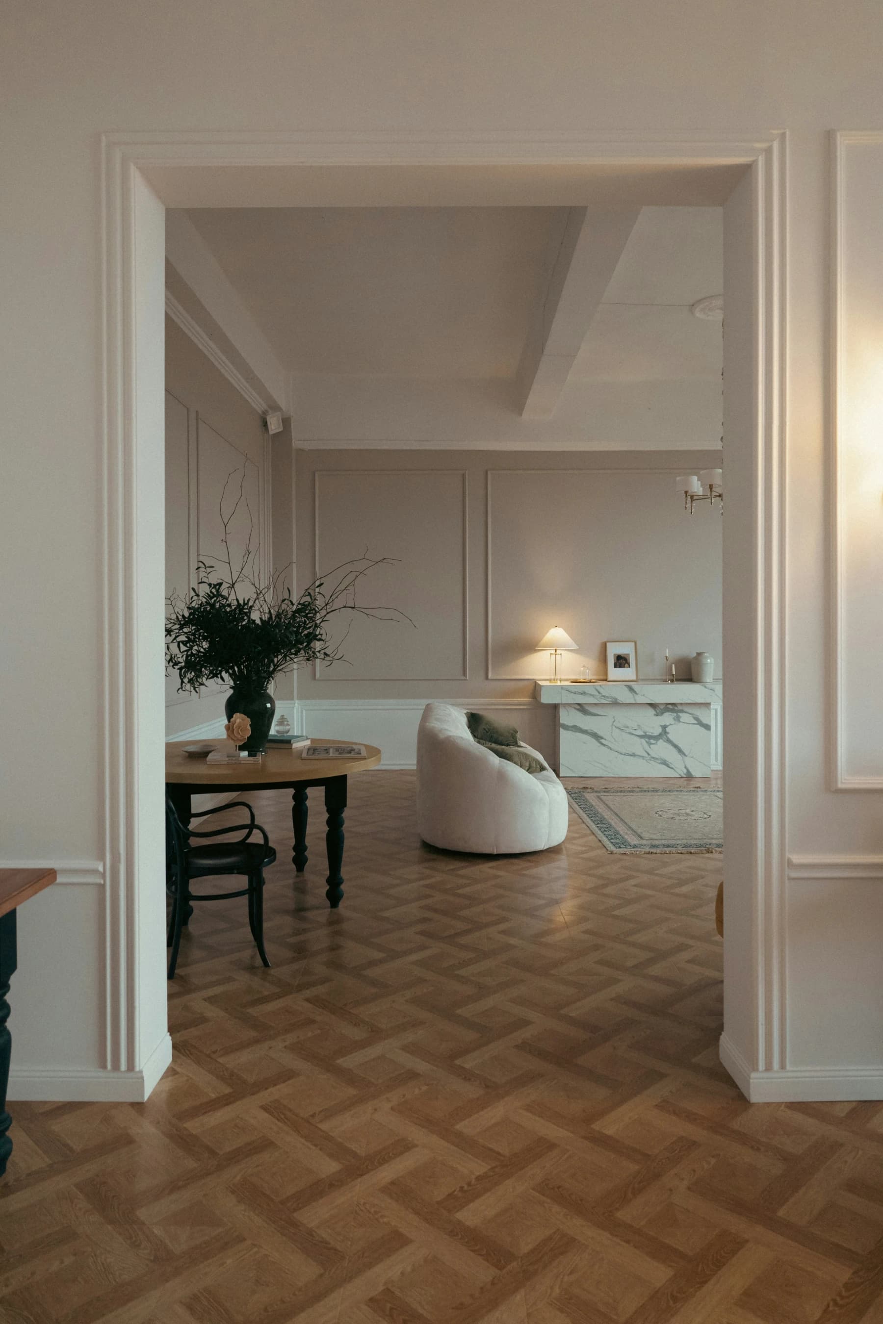
Colors for a Dark Home: Brightening Low-Light Rooms
Warm whites, butter yellows, and sage: the colors that lift a dark, low-light home without renovating.
May 17, 2026 · 7 min read
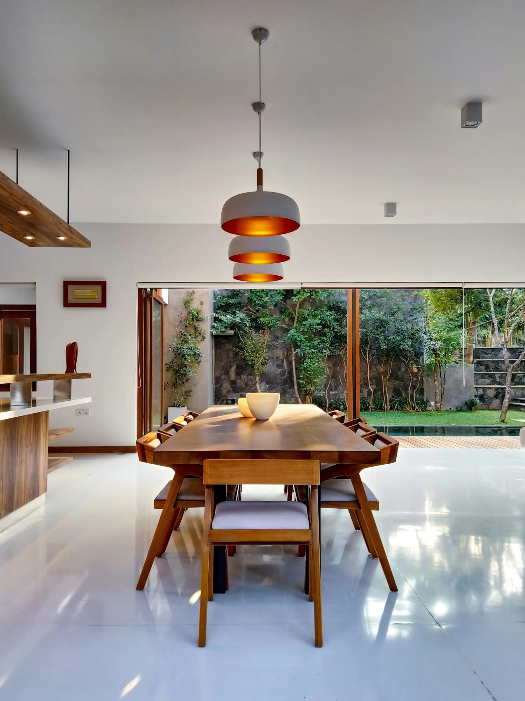
From Dream Home to Ideal Home
The dream home is an image; the ideal home is an answer. How to move from one to the other without losing beauty along the way.
June 30, 2026 · 13 min read
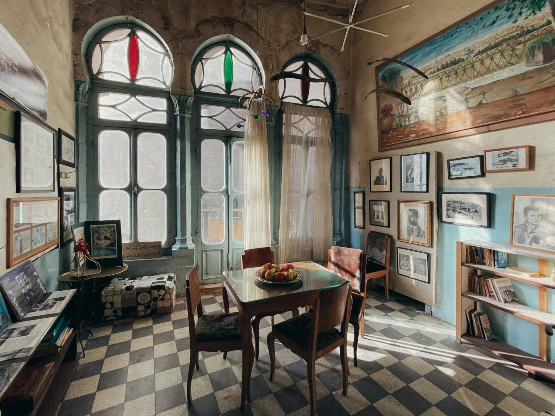
Five Italian Design Styles and How to Bring Them Home
From Roman classicism to Sicilian baroque — five distinct Italian aesthetics and the palettes that define them.
June 15, 2026 · 2 min read
Ready to start your Italian project?
Whether you are buying, renovating, or furnishing, ATRIA guides you every step with a bilingual team on the ground.
Request a consultation